Tuesday, April 10, 2012

An Ad With Bling


This Wixon Jewelers magazine ad ran in the May 2010 issue of Mpls St. Paul Magazine for their Mother’s Day campaign along with a direct mail postcard that was mailed out to their clients. This ad is directed towards men, as the text shows on the side.

The color scheme of the ad is very apparent. There are multiple tones of blue, white, and gray/silver. Looking at the ad and taking into consideration that color scheme, it creates the feeling of being very elegant and classy. Another thing to notice in the magazine ad is the focus of the martini glass. The only objects in focus are the martini glass in the front and the text on the ad. The background and the background martini glass are all out of focus but do a great job in completing the feel of the ad. The rule of thirds is also applied in this ad.

This ad is presented with multiple master tropes. The first one that is apparent is metaphor. The text next to the martini reads "this mother's day treat your wife to happy hours and buy her a round or two  (please bling responsibly)". This is an obvious metaphor that is presented right next to the martini glass with the bracelet hanging out of the top. The text has all the elements to be talking about going to buy a drink for your wife, meanwhile, changing a couple words, and placing that text next to the image creates another meaning.

Metonymy, turning something intangible to something tangible is also used in this ad. Without the text in this ad, there would just be a martini glass with a piece of jewelry hanging off the side. There would be no meaning to the ad. By adding the text next to the image, the ad has much more meaning to it.

One other trope that is applied to the ad is irony. Irony is used in this ad because just by taking a quick look at the it, one would guess it would be geared towards women. The light blue tones, the martini glass, and the diamond bracelet are all elements that would be connected to catching the attention of women. Analyzing the ad a little further, you can see that the text is geared towards men. The text goes on to say "treat your wife". 

Overall, the ad has compositional unity. The entirety of the ad is working together. The image and the text coincide with each other and the ad is very interesting once you notice what the ad is doing. The ad is smart and witty, incorporating "happy hours", "another round or two", and "please bling responsibly". Overall, the ad really did a great job in trying to sell their product.

Thursday, March 29, 2012

Corporate Logos


The Facebook logo is not only widely known across the entire country, but the entire globe as well. Facebook has expanded from being used by a small group of people to being used by millions worldwide. The facebook logo has in fact changed over time and the one seen above is the most current one there is. This logo has rapidly grown universal and is seen all over the world. It's crazy that this little icon shown above can be seen by people all over the world and it still means the same thing to everyone; "facebook".

The first thing that I would like to point out about the logo is the color. Facebook has always used the color blue for everything. The color has never changed and it looks like it will be staying the same for a while. The blue background signifies the zeal and passion of the youth that formed this social network. Along with the actual login site, and website for facebook, the logo is also blue. This is a consistent color scheme in the world of facebook.

 Another thing that I noticed while analyzing the facebook logo was the font. I think that it is very interesting that Facebook as two logos; the one shown above and the one to the right. This logo actually spells out the word "facebook". The font is a custom made font created by Joe Kral. The closest font to this would be Klavika Bold. I think that it was a great idea to have the facebook logo a custom made font so that no one could reproduce the logo. The logo is all lowercase, even in the logo above which is a signature step for the facebook community. I feel that the simplicity of the font captures the attention of the viewers and the users of facebook.

Overall, I feel that the logo of facebook is attention grabbing and unique. Many company logos are bright and flashy hopeing to catch the viewers attention. Facebook was created in 2003, and after just 9 years of utilzation, the company logo is known to viewers worldwide. Facebook is included in the top five social networking sites and the logo does a great job keeping consistency.

Tuesday, March 6, 2012

Personality of Typeface


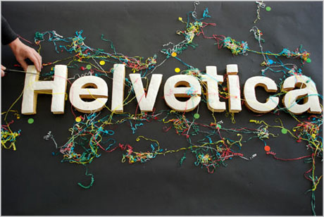
After taking the "What Font Are You" quiz, the result came to be Helvetica. "You're like an industry standard. Classic. Reliable. Okay, a bit boring. But you don't let the haters get you down-- after all, you've still got plenty of friends who think you're the best." This was the description that came along to describe the personality associated with Helvetica.


Dissecting this description a little bit more, I was surprised how close it came to describing the kind of person I think I am. "Classic. Reliable. Okay, a bit boring." I believe this part hits the nail on the head. I like to keep things simple and traditional. I do believe that I am very reliable when it comes to things or people I care about. I try to put others first and do what I can for my friends and family. Touching upon the boring part, yes, I can be boring at times, but who isn't?

Typefaces are a very powerful thing. They are everywhere. They are used for signs, logos, and just plain writing. There are thousands upon thousands of different fonts and typefaces that are used everyday. Type is used to distinguish different businesses, restaurants, and clothing stores. Each has a specific logo with a specific font that separates them from others and helps the public to pick them out right away.

It's amazing how typeface even became invented. Experts have dated the earliest printed book back to 868 A.D. Sometime in the 1000s, a movable type was invented. This was when characters would be carved from blocks of clay and wood, then set, printed, and reused. Because of the movable type, books were able to be printed faster than ever. For years to come, type and print would go through many stages to get to where we are today. The printing press would be the next creation to evolve typefaces. Now we have  the computer to do the typing for us.

Different fonts and types evoke different emotions. This type that I am using is Helvetica, the type to describe my personality.  It is easy to read, clear, and fine cut which is why I understand that it is described as "classic, reliable, and boring". I went into Microsoft work and played around with different fonts. To my surprise, the different fonts really did make me feel different. Some made me feel happy, sad, productive, and even a little childish. After exploring the may different fonts that are provided for us, I can agree that Helvetica made me feel at ease and I liked this type one of the most.

Monday, February 20, 2012

Lines in Cartoons


Garfield by Jim Davis

For our second blog, we were asked to pick a black and white cartoon from any cartoonist and evaluate the use of line and shadow upon other techniques that the artist has used. I have never been a comic strip or cartoon fan, so the only cartoon that I was really familiar with is Garfield. After searching for a good comic strip, I found the one above.

While looking at this cartoon, I stumbled upon many different line techniques that were used by the author. This first set of lines I would like to point out would be the directional lines. There are a variety of directional lines found in this cartoon starting with just the first picture. Directional lines in this drawing are presented beside the tree and around the apple. These lines create a sense of movement. We can tell that Garfield is shaking the tree, and in turn, the apple is moving. Also, in the fourth frame, we can see a directional line behind the apple, allowing us to visualize the movement and pace of the apple.

The next set of lines I would like to address would be textural lines. There are a few examples of textual lines in the comic, such as the lines on the tree and the lines on Garfield in the last frame. The straight vertical lines on the tree in the first and second frame create the feeling that the tree is smooth. Also, there are many textural lines on Garfield in the last fame. The checker-like design on Garfield's side, gives us the sense of "rough" and "banged up". In the previous frames of the comic, Garfield's fur is smooth, while in the last frame, the lines on his back and tail allow us to notice the dirtiness and pain he went through trying to catch the apple.

Gestural lines are also presented in this comic. Throughout the entire comic strip, we can see that the majority of the lines and shapes are curvy and rounded. From the directional lines of movement, to the shapes of the smoke clouds in the third and fifth frame, we can see the smooth gestural lines.

Overall, I can conclude that the artist has used many of the techniques mentioned in class. Before knowing all of the different forms and representation of lines, this would just be a fun comic strip. Now, after learning how the artist can express emotion in just a stroke of a line, its makes it that much more interesting to read the cartoon.

Tuesday, February 7, 2012

Icons Represent


When thinking about what icon best represents me, I had a very hard time narrowing down the options. After racking my brain for a few hours and asking the people around me how to pick an icon that represents me and my personality, I was simply asked, "what are you interested in?" A very simple question with a very simple answer. Finally, I found my icon.

The icon that I chose were skis and poles. The first thing to know is that my father taught me how to ski when I was just five years old. He told me as soon as I put those skis on, I was flying down the hill. Skiing is something special my father and I have together.

Digging deeper into the meaning of the icon and how it connects to my personality as well as my life, ideas just started coming to me. When skiing, you are always moving forward. It's easier and faster to move forward down the hill, which is what I try to tell myself when life gets hard. I've learned to leave the past in the past and keep moving on.

In order to use skis properly, you must have two of them, as well as two poles. You must have balance and rhythm. I have to immediate family members who I consider to be my foundation and my balance; my dad and my sister. They are the two people who keep me going and the two people that I can trust with my life. My father and my sister represent the two skis of my life, because without one, I'd fall.

Along with the skis, you must have the poles to keep your balance. I consider the poles to be like my friends in life. They keep me from falling, and if I do, they help me to stand up. My friends, just like the poles I would use to help me ski, are always right by my side.

The final reason why I chose this icon to represent my personality is because ever since I was a littler girl, I would be so excited to go skiing with my dad. I would snap my skis on, grab my poles, and dart down the bunny hill. As I grew up, I've learned to take it slow and add style to my skiing abilities. After I've learned how to ski the right way, there is not one mountain I haven't been able to conquer. I believe that this is so similar to my life in that I have my family and friends always with me and learn to take life as it comes, I can get through anything that comes my way.